


historically, pixel art was rendered on limited hardware, there were strict limits on how many colours could be displayed on screen at once and in a single sprite.
These limits no longer exist, so you are no longer beholden to any of them. Despite what you might hear in certain pixel art spaces, there aren’t really any rules anymore, because there’s no technical limitations forcing you to work a specific way. You can make your pixel art have as many colours as you want, be whatever size you like, and have as many frames as you want it to.
However! the smaller you make a sprite, the harder things will become to read unless you shrink down the number of colours in equal measure.
In a photo you might have. i dunno. 1,000,000 pixels in it or something like that. Thats like a really small photo but that’s still so many pixels that you don’t really notice any of them individually. They all blend together into one big mass to tell you what you’re looking at in groups of hundreds!
On the other hand, in a 16x16 sprite you’ll only have 256 of them. Every single individual pixel can have something to say!
But if every pixel is trying to say something at once, it muddies the sprite and makes it hard to read. However, if a group of pixels are all the same colour, they’re all saying the same thing, and it becomes a lot easier to understand what you’re looking at.
like, for example, take a look at this 16x16 crop of a random photo.

does that look like a whole lot of nothing? yeah . theres 256 pixels, and theres 256 colours. the pixels aren’t really working together to tell you anything, so instead it just becomes one big vague mass. if i reduce the colour count to just 6 colours and increase the contrast, though,

it starts to look less like visual noise, and more like water at sunset!
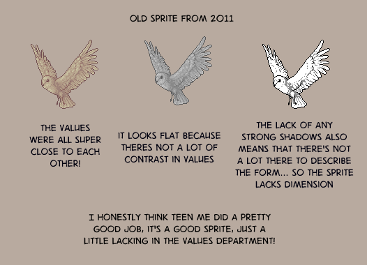
The contrast is important - part of why you want to keep your colour count low is to make groups of pixels distinct from each other.
But, how exactly do you keep your colour count low, anyway?
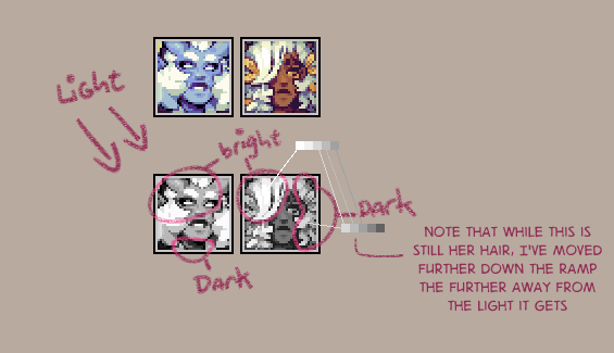
a colour ramp refers to the gradient of colours in your palette that are used to shade one particular colour, such as tempests hair or her skin
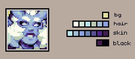
instinctively you’re probably going to want to make individual gradients of colour for each of these things.
however, if you connect these ramps together, you can greatly reduce the number of colours you’re using in your piece. This also helps create a cohesive palette!
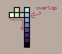
when it comes to connecting ramps, value matters much more than individual hues. you want to have a good range of values to have a readable sprite!
I think actually a really good example of value mattering more than hue in sprites, is this guide to anti aliasing by pixeljoint user ptoing
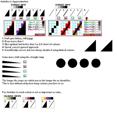
also just generally good advice, but take a look at this bit in particular
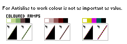
despite the wildly varying hues, they work together just fine. by focusing on the value when you combine your ramps, you can create some really interesting colour palettes!
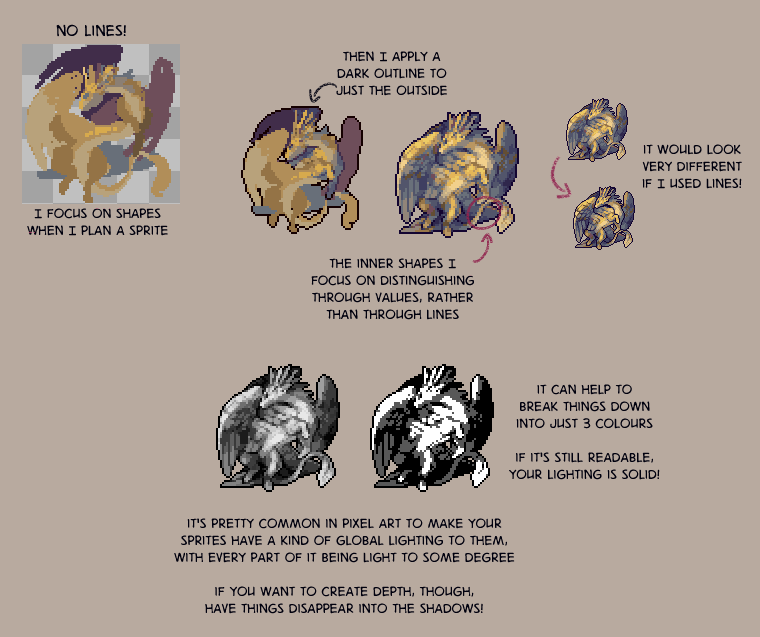
anyway. now for some vaguer notes on how i do lighting
anyway thems just some thoughts for you all
You can also find this post on Tumblr.
No comments yet!