Prelude
For me personally, it's very important to me that my characters feel like real people—in both how I write them, and also what they look like.
It's not necessarily about them being realistic (although my art has certainly taken a more realistic slant as of late and that is related)—I mean, a significant chunk of them are demons, they're certainly not realistic I am very much making fantasy characters—but that they feel like.. People.
Like they've lived the lives that they've lived, and it has made them who they are, and like you could just kind of? Meet a person like that, under the right circumstances?
It's like... I don't really ever see myself in media, and the people I love, my friends, my family, there's such a wide variety of people I know that I really am not seeing reflected back? And this void is what makes me want to create in the first place. It's a void that shouldn't be there.
So, if people can see themselves in my art, people like myself, my mother, my friends, those who are so often told they should not exist at all, then I've succeeded at something, I think. It's a philosophy so intrinsic to my design process that it's impossible to talk about my approach without talking about this first, as it underpins every decision that I make!
Phase 1: Body
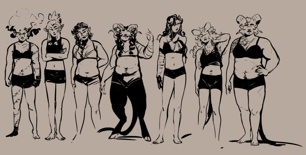
So when I design a character I have at least some vague idea of the kind of life that theyve lived and the sort of person that they are. This effects their physique to some extent, i.e. It determines whether or not I make them buff (my characters who sail, for example, have more muscle mass than those that don't), but also importantly it effects how they carry themselves.
A character's body language is one of the very first things I think about—how a character moves, how they interact with the world, to me it's the core of depicting them as a person. We talk a lot about silhouette in character design, an oft forgotten part of this I feel is the character's body language!
As an example here are some of my girlies—physically they have various different physiques, but even those who are similar have different ways of holding themselves.
Phase 2: Face
A characters face I put a lot of thought into—I try to think of a face that I haven't really drawn before. It's not so much that I'm avoiding "same-face" so much as everyones face is just so wonderfully different, you know? Some faces have sharper features, some are softer, some faces look older and some younger... It's fun to explore the different kind of faces there can be :)
I know it's pretty common to have faceclaims for your characters, but personally I don't really have those—I just think about the different kind of features I've seen and combine them to create new faces... A little bit like making miis, honestly. But with like, real people faces. (Even when my work was more abstracted I was still thinking of real people faces!)
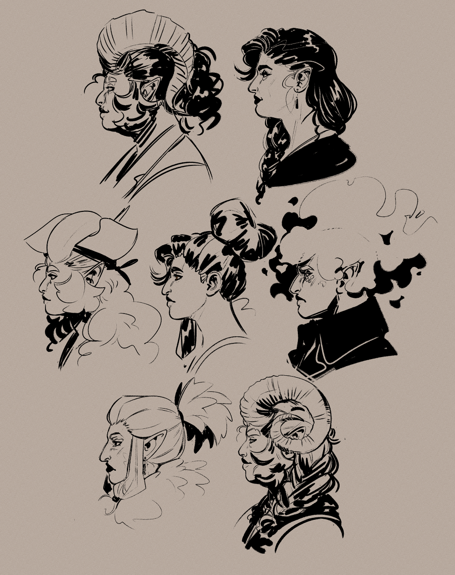
My hot tip: the nose carries in it so much life and character, and shapes the rest of the face! It is into a character's eyes and nose that I put the most thought, personally.
A lot of art seems to kind of diminish the nose until its almost not there (including a lot of my own older art), but personally speaking I have a big nose... And every time I draw a new nose it delights another person who has a similar nose :) So I'm doing my best to get better at drawing them 😤
Phase 3: Outfit
Tip: while figuring out designs especially for outfits and hairstyles, I use the symmetry ruler to save some time while I try new things. I disable snapping when I want to break the symmetry! I like to have a mix of symmetrical and asymmetrical elements in a design.
A fun place to add some asymmetry is in the hair, but symmetrical hairstyles are easier to figure out from different angles... I dont have any specific advice for designing hairstyles I just go buckwild and make it look like theres logic to it after the fact LMAO..
Anyway! Let's actually talk about shapes!
The majority of my characters have multiple outfits—I simply like to dress up my little guys ❤️ but every character starts with one outfit, their hashtag #look if you will, which then influences every other outfit I make them.
My process for designing these outfits is as follows:
-
I first answer this question: what image does this character consciously project?
E.g.: Tempest is a woman who cares a lot about her image and projects an aura of confidence and self assurance, whereas Callisto does not and projects an aura of unimportance and humbleness.
Ergo Tempest's outfit is carefully chosen by herself to create the image she wants to project and is bold and eyecatching, whereas Callisto does not want to draw attention to herself and as such she wears much more subdued clothing.
-
Then it's time to open up Pinterest
By this point in time I know who this character is or at the very least their concept, and ergo I have a solid idea about what their aesthetic vibe is E.g. Pirate, fruity wizard, goth, etc. So I open up pinterest and I begin to make a fashion board for this character.
I look at a mixture of real world fashions both modern and historical for this, as well as LARP fashion for that specific fantasy flavour. It's a good idea to draw from a wide variety of influences, including those that do not fit the specific vibe you are going for.
Note: I do not look at other fantasy/concept art for this.
The reason is, quite a lot of fantasy art is like a one-time image, and a lot of concept art is very removed from reality, so a lot of the time things only work from one specific angle and don't have any underlying logic to them.
Being that all my characters are created for a comic, I need to be able to draw them from any angle. I am not a costume designer, I do not know how to make clothes. But looking at real life clothing ensures everything I design is at least drawing inspiration from something that can be physically worn, so it gives my outfits some grounding in reality.
The further abstracted your sources get, the less grounded in reality your designs will become—which for me personally and my specific tastes and goals, is not desirable.
-
Look for recurring motifs in what makes up the specific aesthetic vibe you're going for
(e.g. Pirates: fancy jackets, loose cotton shirts, sashes and belts)
-
Fashion is all about the shapes you create with the clothes that you wear.
Different fashion trends are all about what shape is currently considered "in"—it's not about "high waisted pants", its about the new shape that the higher waistband creates.
To create fantasy outfits that feel fresh, look at current and past fashion trends and figure out what shape theyre creating—then recreate that using the motifs you found and try use other kinds of clothing not necessarily often used to create this shape.
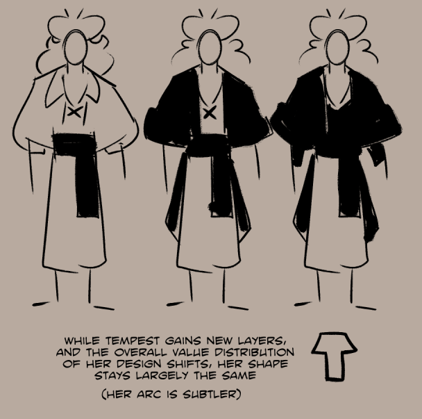
Tempest's outfit recreates the high waisted shape with a sash tied around her waist. Her loose poet shirt obviously creates the same shape as a loose jumper being tucked in, but I cropped the front of her jacket short and gave it large sleeves to create the same shape.
This is why its good to draw from a variety of influences—it gives you a wider pool of shapes to draw from, and you can then combine them to create something new! I may be designing a pirate character, but the shapes are pulled from modern fashion.
-
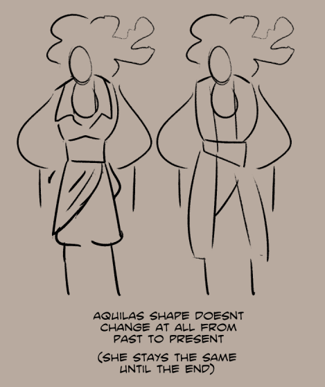
When creating another outfit for a character, using a new shape can be used to symbolise a drastic change, while maintaining the same shape but changing the overall value can symbolise a more subtle shift.
For example, a drastic change of shape can be used to supplement a character arc with a more extreme change, or perhaps supplement a situation wherein there is a drastic shift in how a character is acting or the role they are performing even if they as a person have not changed.
On the other hand, maintaining the same shape but changing the value balance of the outfit can indicate a more subtle change—such as a character slowly letting their walls down! Hairstyle too is great for this, such as a character slowly letting down their hair as the story progresses... A pun and a great way to gradually change their shape :)
Or, another way to put it—keeping the same shape will keep the same general vibe, while changing the shape will create an entirely new vibe.
Here's some examples of this in action!
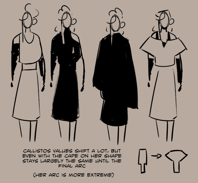
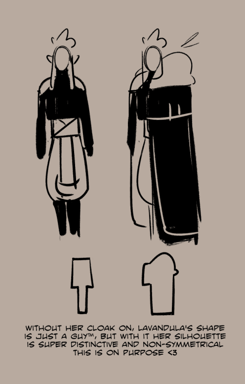
Lavandula is simultaneously a very guarded woman with a very controlled image who does not like to let any of her true self show through, and also a woman who is incredibly transparent and easy to read the second you find the crack in the mask.
She has two very drastically different shapes that she alternates between because she is as a person, very extreme. I wanted her silhouette while wearing her full regalia to be extremely distinct from any other character I have bc she is not in the least bit subtle ❤️
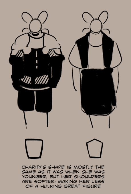
Charity and Rosalie don't specifically have arcs as their story happened in the past and it isnt relevant to the events of Heart of the Storm as their role in this story is a supportive one, but their past is still reflected/contrasted in their current designs!
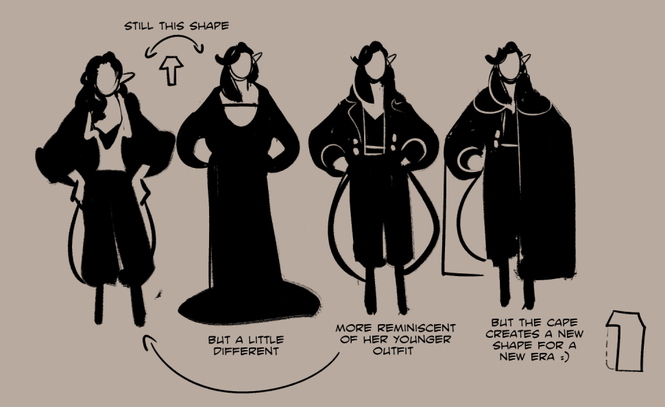
Rosalie especially I think is a good example of using a different shape in a different context to show a shift in how she's acting, but not in her actual arc itself. She just shifts roles for a little bit :)


3 comments
Alxy
Harrie
.